Monday 31 March 2014
Friday 21 March 2014
Looking back at your preliminary task (the continuity editing task), what do you feel you have learnt in the progression from it to full product?
 I believe the main progression from my preliminary is my ability to use all the software available and the broadening of my understanding as to how a magazine is created and all the key features and conventions as to what attracts an audience to the magazine . Firstly i have developed greatly my ability to use Photoshop , to begin with during the prelim stage i only had very basic skills and knowledge of Photoshop such as being able to edit and roughly cut out and add affects to photos .My ability to use this program has gradually progressed throughout the making of my magazine, and after producing my draft it is clear that i have a much more in depth understanding of all the elements , tools and effects of this program . I think you can see for yourself that in comparison to my prelim the editing and precision of the magazine is of a much higher standard, showing my improvement throughout the course.For example my ability to add shadow effects to photos , I also am much more efficient; getting simple tasks such as editing objects and layers completed quickly.
 My understanding of how magazine should look , and the context of magazines had majorly improved , and this was mainly due to the amount of research as I was learning how magazines appeal to an audience and the techniques, conventions and features they use, such as the rule of three and the use of the golden spiral for photographs. I learnt that it was key to have a CVI which is why i then went on to base my magazine around the CVI to make it powerful and have an impact towards the reader.
 As you can see , the points of interest are not as strong in my preliminary magazine, there is not enough going on in the points of interest , for example the top left hand side of the page there is nothing going on except for a few letters, this in comparison to my final Front cover , as you can see there is a massive improvement with lots going on inside the hot spots.

From the beginning to the end i have come a long way in developing my skills and knowledge on the technologies used like Photoshop. I have developed a more deeper understanding of where things should go on the page , and where to put things so that it would attract the audience.
Audience of media product
Who would be your audience for your media product ?
Matthew Hopkins is a 17 year old male from Narborough , Leicester. He attends Lutterworth College where he is currently studying for his A-levels .Matt works part-time at castle freight a warehouse loading arctic lorries .He is a keen footballer , and plays most weekends . He enjoys socializing with his friends , weather it be attending parties or just a relaxed Friday night . He also likes spending time with his girlfriend and enjoys going out for meals with her and going to see films . Matt very much dislikes any form of screamo music and punk rock . He is a competitive lad and one of his pet hates is loosing at anything in life , he dislikes anybody that tries to be somebody their not , and also hates his vegetables .As Matt is studying business , he hopes one day he will be able to set up his own business in the music/fashion industry . But really at the moment Matt sees the world as his oyster and any opportunity that comes along in life Matt is willing to grasp with both hands .He has always had a huge interest in Alternative music , some of his favorite artists include : Crystal Fighters , The Wombats , Peace and Arctic Monkeys . Matt has been to Reading Festival 3 times in a row , and now plans to go to Glastonbury 2014 . He Idolizes David Beckham not only for his incredible footballing career , but also his work off the pitch . Matt feels he is a very genuine guy and all of the work he has done to help charity and help our country make a name for itself is amazing .Matt has to do long distance journeys both to college and his close family therefore he listens to a lot of radio. His favorite stations are XFM radio and the Radio 1 Breakfast Show. Matt doesn't really have any films that link with his music preference as not many films are made with an alternative soundtrack .
For research on my audience I went on Chanel 4 UK Tribes and looked at the different types of people that could potentially read my magazine and I went for Hipsters as being the type of people who would read my magazine mainly because of their dress sense, which would be the same as what the magazine would consist of, and also how Matt dresses very alternative and hippie fitting him in this audience group . Also the type of music that would be in the magazine because that would also match what hipsters listen to e.g. Crystal Fighters and The Maccabees . Also for my audience research i found Indie scenesters , From what I have been reading from this, I have learnt that Indie crowd are the people that are the most interested in music, and they would do anything to find the newest and upcoming music . They also have reputation to bring back the fashion from a long time ago, such as bringing back the flares look most recently which has come from the 80's time period. I could use this for my magazine because it then gives me the idea that I should be introducing a new band so that which is what I would be able to emphasise the whole magazine on. Another thing about Indie scenesters is that they are known for going to festivals, so this could be introduced in my magazine as I could hold interviews with bands and also the indie crowd that have been to a festival like Reading or Leeds . In my magazine to be able to appeal to this audience I will need to keep it specifically about this time of genre and not go off on a tangent talking about other things irrelevant to this genre as pretentious fans of the indie/hippie genre would not appreciate it . I will also need to incorporate the language terms that will relate to this group and not talk to formally or informally but get the balance jut right . I will need to maintain the iconic fashion that the indie/hippie group have made so famous throughout this lifetime throughout my magazine , using relevant models and relevant clothing to connect with this group on a personal level . .
Thursday 20 March 2014
What kind of media institution might distribute your media product and why ?
Bauer - Bauer is Europe’s largest privately owned publishing Group. The Group is a worldwide media empire offering over 300 magazines in 15 countries, as well as online, TV and radio stations.Bauer Media is a multi-platform UK-based media Group consisting of many companies collected around two main divisions – Magazines and Radio - widely recognized and rewarded as being industry innovators. If Bauer were to publish my magazine it would be great as it wouldn't just publish it in the UK , it would publish it on a worldwide global scale , and enable indie/hipster groups from other countries to be given the chance to enjoy my magazine . Also with Bauer being such a well known publishing company it gives me confidence in their abilities to publish me the exact magazine I want and meet all of my requirements . Also Bauer doesn't just publish your everyday magazine and pop music magazines , at allows for more niche audience magazines like my own to be published and put out their which would massively benefit my magazine hugely .Tuesday 18 March 2014
In what ways does your media product use , develop or challenge forms and conventions of real media products ?

Whilst designing my Indie/Alternative music magazine , i took a wide range of inspiration for the layout and design of my magazine from the very popular well known clash magazine . The title of my magazine is visibly similar to the Clash magazine , maintaining the simplicity yet professional look of a one word title . Clash is renown for its brash white titles , so to add individuality i made my title black , giving it the look of a Clash magazine but keeping my own relevant style . Graphologically my magazine challenged the conventions of a Z,H or E layout by trying a more unique style . My magazine layout consisted of a modified E , as the base text is slightly raised from the bottom of the page , and there are clear columns down the sides. However this is a layouts often seen in more niche magazine like clash , who also add the over sized plus sign to make a feature of the additional elements of my magazine . The costumes, props and iconography i used cleverly attracted my target audience , with Clash being my inspiration and knowing that it is famed for being a fashion influenced magazine i knew it was crucial to make these three things professional . Costume wise i stook to the classic check shirt keeping a smart , sophisticated feel throughout but sustaining the alternative genre. In relation to the hair i styled my model on a more retro alternative look , but also Alex Turner of the Arctic Monkeys is currently sporting a quiff who is idolized around the world , which is why i chose this. This style continues throughout the magazine , keeping with the same outfit and style for the contents page close up , in comparison on the double page spread i slightly tweaked the style , abandoning the quiff and going for a more edgy look , with the messy hair and the plain black top . For the camera work and framing of my images , my magazine looks very professional and similar to the clash magazine as i have made the CVI my strongest piece , with the model looking directly at the camera and making eye contact with the reader to give it that edge and make it look appealing on the eye . I specifically chose a mid shot , with my model central looking directly at the camera . Researching into Clash magazine it was clear to me that this was the best shot to do , to add effect and make the magazine as professional as possible . This also benefited my pictures as my model is very photogenic allowing for the shot to work , and allows my artist to connect with the reader. This is a feature throughout my magazine , again on the contents this time we have a closeup but still i wanted to keep it a running theme of staring down the lense . On the contents page this is very effective as with it being a close up it allows you to see more of the piercing eyes , enabling the artist to connect with the reader . I challenge the conventions of having white text on a black background or " WOB ", by using black text on a white background like " Bo Alarcon ".

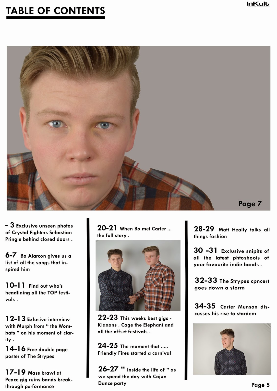
For my contents page this time i took my inspiration from the ' Fader ' magazine , this layout is very simple which fits in with the layout of all my pages throughout the magazine. My main focus on all pages was a eye catching CVI and this contents enables me to include a large photo above the text to catch the readers attention instantly with the image. Camera wise i have used a close up as my main image of my model , with him staring directly at the camera and the camera being focused on his eyes which is the running theme throughout to build a connection with the reader and draw them in. I tried to be a bit different with my contents by using a different inspiration rather than sticking with clash magazine throughout. Honestly I didn't like the clash magazine contents page so i looked elsewhere for my inspiration and found Fader's contents page which i feel suited the house/simple theme of my magazine and gave me the confidence that i could work with the layout of it and make it look edgy and alternative . On my contents page i also decided to bring in another model to create a new artist in the magazine , which enable me to create new things such as " When Bo met Carter " allowing me to unite the two together to create a new page in the magazine which i think worked well. This allowed me to get a good camera shot of them both shaking hands , i knew i wanted specifically this pose to look professional and realistic. This is known as a grip and grin shot, a photograph of no inherent interest in which a notable and an obscure person shake hands at an occasion of supposed significance, in this case when both of my artist met each other.
I haven't used a long shot in this issue of the magazine as i didn't feel it worked , and was relevant , so for the double page spread i used another mid shot , this time adding the effect of black and white to keep it relevant to the house theme that my magazine portrays. Also the framing of every shot in the magazine is well presented , all the key features are there and they are all centrally framed and have good CVI which is what my intentions where in my plan . Also the running theme throughout the magazine continues as i have already explained with the eye contact , which is made on every single photo , gives my magazine a brand and style and allows it to look professional . When deciding on my style and font for my magazine , i tried to keep it basic and simple as it was more suited to the genre i'm going for and all the inspiration i looked at had a very simplistic approach . My masthead font is very simple yet extravagant and bold to create emphasis and attract a potential reader to the magazine . I stook to one font for most of my other writing which was called Tw Cen MT , this font is a very effective font , its not to in your face or over the top it creates the perfect balance across the page . The genre i am targeting my magazine at are Hipsters and Indie Scenesters . I feel as though my front cover portrays this genre as i got the correct model , who himself is an indie/alternative character giving my magazine the head start . Also the style , layout and balance of my magazine on all three pages holds its own uniqueness and individuality and that reflects an indie character . I feel as though the fashion in my magazine suggests the indie genre , and also the hairstyles of my model is of a stereotypical indie person . I also think the house theme running through my magazine had a part to play , as it made my magazine appeal to a very niche audience and give it that little something different . My artist is represented cleverly as an alternative/indie solo artist , i purposely did this to help enforce the genre and attract the niche target audience i am aiming my magazine at . He is represented as a bit of a bad boy but with one dream . My models fashion suits the type of people that will be interested in my magazine . He has an indie haircut which will help distinguish the genre and audience . In most of the photos he has an arrogant look about him , giving him a " rebellious " title and increases the idea that is an indie/hipster magazine. The colour scheme of my magazine is simple , my inspiration clash magazine works with basic colours so i try to keep that same mentality within my magazine using black and white . However most magazines embrace a 3 colour pallet , which i attempted to achieve with the reds on my models shirt mixing with the black and white of the layout .

Friday 14 March 2014
Explanation
It is apparent after looking at at many magazines that there is a range of shots throughout including a long shot . You will be able to see by looking at my magazine that i haven't used a long shot , this is because after many failed attempts i realized that a long shot did not work for the style of my magazine and wasn't working well with the layout of my page for this issue of the magazine , so i used another mid shot . Looking into the future i have no doubt that in other issues of the magazine there will be long shots , but for this particular one , i felt it did not work and was not necessary .


Subscribe to:
Posts (Atom)