Thursday 30 January 2014


Monday 27 January 2014
Aritst and album names
My artist will be called Bo Alarcon , I got this name off random word generator , and I am very pleased with the way it has turned out , as I feel this name is perfect for the genre of my magazine and the alternative artist I want to create .
My album name is going to be procrastinator , I also got this off random word generator but feel as though it fits excellently with the artists name and compliments it well .
Tuesday 21 January 2014
Friday 17 January 2014
Analysis of Institution
Analysis of Institution
Bauer - Bauer is Europe’s largest privately owned publishing Group. The Group is a worldwide media empire offering over 300 magazines in 15 countries, as well as online, TV and radio stations.Bauer Media is a multi-platform UK-based media Group consisting of many companies collected around two main divisions – Magazines and Radio - widely recognised and rewarded as being industry innovators. If Bauer were to publish my magazine it would be great as it wouldn't just publish it in the UK , it would publish it on a worldwide global scale , and enable indie/hipster groups from other countries to be given the chance to enjoy my magazine . Also with Bauer being such a well known publishing company it gives me confidence in their abilities to publish me the exact magazine I want and meet all of my requirements . Also Bauer doesn't just publish your everyday magazine and pop music magazines , at allows for more niche audience magazines like my own to be published and put out their which would massively benefit my magazine hugely .

relevant photographers , graphic designers and magazine creators

David Carson is an American graphic designer , art director and surfer . He is best known for his innovative magazine design, and use of experimental typography. He was the art director for the magazine Ray Gun , in which he employed much of the typographic and layout style for which he is known In one issue, he notoriously used Dingbat, a font containing only symbols, as the font for what he considered a rather dull interview with Bryan Ferry (However, the whole text was published in a legible font at the back of the same issue of Ray Gun as well). In 1995, Carson left Ray Gun to found his own studio, David Carson Design, in New York City. He started to attract major clients from all over the United States. During the next three years (1995–1998), Carson was doing work for Pepsi Cola, Ray Ban, Nike, Microsoft, Budweiser and Giorgio Armani. In 2004, Carson became the Creative Director of the Gibbes Museum of Art in Charleston. That year, he also designed the special "Exploration" edition of Surfing Magazine. In a feature story, Newsweek magazine said he "changed the public face of graphic design". In November 1995, Carson published his first book, End of Print. It sold over 200,000 copies in five different languages and soon became the best-selling graphic design book worldwide. I don't really consider David Carson to be the right graphic designer for my magazine as I feel some of his designs are quiet boring and lack the distinctive edge I am looking to get in my magazine , also I find his font choices rather bizarre and would definitely not work in harmony with all the other things throughout my magazine .
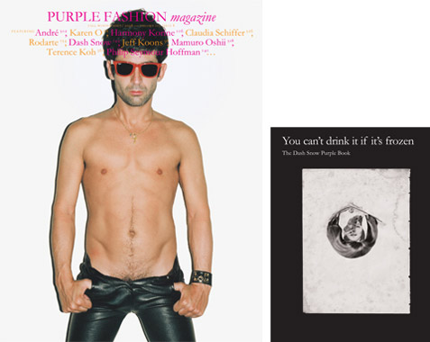 CHRISTOPHE BRUNNQUELL was the creator of the magazine Purple, he is the genius that has changed how many magazines look nowadays, as his magazine was based on nearly all images, it has revolutionised the way that magazines are created. He has influenced many people to change the way in which they create their magazines, instead of basing it on writing he has used creativity to just use images. This style gives the magazines its own, unique type and separates it from the other competing magazines. For his magazines he often uses a lot large white area space as shown on the picture on the right , and in a weird way I find this to look very professional and it just makes the magazine distinctive from opposing magazines because it is different. Christophe is similar to the style I would like in my magazine I admire his individuality and contrast between modern magazines. I think his specific work would work well with a music genre such as Indie music which is what my genre is . Also this could apply to popular music and my magazine if I chose to just focus my work on just providing images , but really my focus in my magazine Is to get incredible image and revolve the magazine around that so it would work well .
 Steven Klein is an American photographer based in New York , after studying painting at the Rhode Island School of Design, he moved into the field of photography. Klein shot high-profile advertising campaigns for various clients including Calvin Klein, D&G, Alexander McQueen and Nike and is a regular contributor to magazines including American and Paris Vogue, i-D, Numéro, W and Arena. His work has featured in numerous exhibitions, most recently at the Gagosian Gallery, California and the Brancolini Grimaldi Gallery in Florence. Klein is well known for his W Magazine editorials with Madonna, Tom Ford, Brad Pitt and numerous others. He has inspired me In my photography as he has worked with some of the all time greats , and work for many famous magazines and brands. And despite him working with some huge magazines I think he would be the perfect photographer for my magazine as his images are simple which allows me to use mastheads and cover lines around the image effectively to fill in the negative space and also he seems to capture an image very well and change up the poses used to make every image different .
Language Register
For my magazine the language register will be mostly formal , there will be the odd page in the magazine that will some slightly informal euphemisms . You shouldn't expect there to be the type of language you would see in a hip-hop / R&B magazine that would feature drake , but as the magazine could include interviews with bands you could expect to here swear words and other taboo language . You could expect a lot of festival Jargon to feature and a lot of indie related jargon so the language will be very pompous and pretentious as most indie bands demand a lot of respect even when they haven't earned it . With their being a lot of indie bands featuring you should expect to see many neologisms in the language register throughout as many bands will have made up words that most of the reading audience wouldn't understand , the coincides with the exclusiveness of the magazine as it is only aimed at a niche audience who can relate to the language . Language and power will also feature in my magazine , as many of the bands will hold influential power over the reader as they are seen as icons and are loved .There will be many monosyllabic words as bands may not want to give anything away when being interviewed , but on the other hand there could be polysyllabic words as when bands are being interviewed they could be over pretentious and steel all of the limelight . From looking through many other popular music magazines and also analysing them it is clear that the language in them is also fairly informal , many of the interviews in the NME magazine have very informal taboo language , which will also typically be in my magazine too as their will be interviews with many pretentious indie bands that wont be phased by the language they use . Also it is clear to see that they keep the language very simple , but they also make it very creative by slipping in the language techniques when they are needed to give the text they are writing that extra depth . And this is what I will attempt to do in my magazine , the language used may not be very formal , but I will try as much as possible to get the language techniques into the text to make them simple but effective .
Audience Profile

Name : Mathew Hopkins
Age: 17
Background: Matt lives in Narborough , Leicester and attends Lutterworth College where he is currently studying for his A-levels .
Occupation : Matt works part-time at castle freight a warehouse loading arctic lorries .
Likes : Matt is a keen footballer , and plays most weekends . He enjoys socialising with his friends , weather it be attending parties or just a relaxed Friday night . He also likes spending time with his girlfriend and enjoys going out for meals with her and going to see films .
Dislikes: Matt very much dislikes any form of screamo music and punk rock . He is a competitive lad and one of his pet hates is loosing at anything in life , he dislikes anybody that tries to be somebody their not , and also hates his vegetables .
Ambitions : As Matt is studying business , he hopes one day he will be able to set up his own business in the music/fashion industry . But really at the moment Mat sees the world as his oyster and any opportunity that comes along in life Matt is willing to grasp with both hands .
Musical Preferences :Matt has always had a huge interest in Alternative music , some of his favourite artists include : Crystal Fighters , The Wombats , Peace and Arctic Monkeys . Matt has been to Reading Festival 3 times in a row , and now plans to go to Glastonbury 2014 .
Idols : Matt Idolises David Beckham not only for his incredible footballing career , but also his work of the pitch . Matt feels he is a very genuine guy and all of the work he has done to help charity and help our country make a name for itself is amazing .
Media Consumer Habits: Matt has to do long distance journeys both to college and his close family therefore he listens to a lot of radio. His favourite stations are XFM radio and the Radio 1 Breakfast Show. Matt doesn't really have any films that link with his music preference as not many films are made with an alternative soundtrack .
Thursday 16 January 2014
Tuesday 14 January 2014

Reflections
Coming into this coursework task i have had no experience at all using the specific technological equipment needed to produce my magazine such as Photography , Photoshop , and all the different background information . I have learnt about the different lights and lighting effects that can be used when taking a professional photo for a magazine .The key light - The key light is the first and usually the most important light that a photographer will use in a lighting setup . The purpose of the key light is to highlight the form and dimension of the subject . The fill light - The fill light may be used to reduce the contrast a scene to match the dynamic range of the recording media and record the same amount of detail typically seen by eye in average lighting and considered normal. From that baseline of normality using more or less fill will make shadows seem lighter or darker than normal which will cause the viewer to react differently, by inferring both environmental and mood clues from the tone of the shadows. The Hair light - A hair light in a portrait setup adds dimension and drama to the image by accenting the shoulders and crown of the subject. Like adding spice to a dish, adding a disproportionate amount of hair light can overpower the other lighting and ruin the final image. The brightness of the hair light should never be the first thing you notice about a portrait . Throughout my experience i have learnt how to correctly used a tripod to get the best angles and heights for my photos , soon after i began to learn how to use Photoshop and everything that it involves like editing, air brushing, cropping and cutting them. I will also select different colours and text to compliment my photo and make it to the best of my ability.
I have decided that the title of my magazine will be " INKULT "
The genre i have chosen for my magazine is an indie theme , i have chosen this as i feel that going down this road is most likely to get me a better grade as it will enable me to make a better magazine . Also i occasionally listen to more alternative music so it will suite well . i also want to bring back the old school times with bands like The jam .
Fashion
Fashion wise i would like the model of my magazine to clearly be indie , but i'm looking to switch it round a little and make it indie/smart by having my model wear a shirt and smart clothes but sticking with the indie theme .

 The 1975
 The Jam
The genre i have chosen for my magazine is an indie theme , i have chosen this as i feel that going down this road is most likely to get me a better grade as it will enable me to make a better magazine . Also i occasionally listen to more alternative music so it will suite well . i also want to bring back the old school times with bands like The jam .
Fashion
Fashion wise i would like the model of my magazine to clearly be indie , but i'm looking to switch it round a little and make it indie/smart by having my model wear a shirt and smart clothes but sticking with the indie theme .
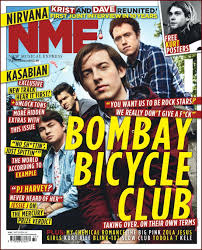
I want the layout of my magazine to resemble the layout of the NME magazines as they have a basic but very appealing layout that clearly extenuates the artist . I want the model i choose for my magazine , to represent the music similar to the genre i have chosen and bands that will be included inside such as The 1975 , Arctic Monkeys and The jam .
Bands
The 1975 The Jam
Targets
Today's Targets : By the end of today's lesson i want to have completed all of thew tasks set to a satisfactory standard , and have a clear understanding of what genre of magazine i want to create and how i shall go about producing .
Weekly Targets : By the end of the week I want to have completed the level 4 targets set on Mr Smith's blog and analyse my favorite magazines in more detail.
Prelim school magazine

How does your prelim represent particular social groups?
As it is a school magazine the theme is obviously academic. This means it is aimed at students aged between 14 and 19 or years 10 - 13 at Lutterworth College which is a college with an approximate population of 2000 students. This is a niche market and this magazine will only be relevant to the students that attend the school. Also it will stereotypically seem to be more aimed at the nerdy type of social groups as the front cover is about grades and education but also the magazine includes music and sporting news may attract other potential readers.
Who would be the intended audience for your product?
The intended audience will be any student that attends Lutterworth College that wants to keep up to date with what is new and happening at the college. The intended audience will be the more nerdy type social groups as stereotypically they would be more interested in the magazine. However including news from the schools music and sporting achievement's may attract other audiences.
How did you attract/address your audience?
I attracted my audience by using a photo of the colleges student with the highest grades , to give people something to aspire to . I also used some recent news on the front cover about Adam Chapman's success in his A-levels . However if I was to redesign this now I would know to include sporting and music opportunities and achievements on the front page to attract a different variety and more of an audience.
What have you learnt about technologies from the process of constructing this product?
I have learnt that Photoshop can be a difficult piece of software to use. Personally it takes me a lot of time to grasp the concept and incorporate things into my work effectively . I will ensure when i come to make my real magazine that i have developed my skills on Photoshop .
Friday 10 January 2014
Class notes
Class notes This picture below is a draft of the 3 different plans available for my magazine front cover . The first plan is the " Z plan " the second plan is the " E plan " and the final plan is the " F plan " . For the front cover of my magazine I have chosen to us the " Z plan " as I feel it has a very simplistic layout , yet has exactly what you need to produce a quality magazine front cover .

The Three stage lighting effect
The Three Stage lighting effect is the process that highlights the 3 main lights needed in a scene or photo shoot .
The key light - The key light is the first and usually the most important light that a photographer will use in a lighting setup . The purpose of the key light is to highlight the form and dimension of the subject .
The fill light - The fill light may be used to reduce the contrast a scene to match the dynamic range of the recording media and record the same amount of detail typically seen by eye in average lighting and considered normal. From that baseline of normality using more or less fill will make shadows seem lighter or darker than normal which will cause the viewer to react differently, by inferring both environmental and mood clues from the tone of the shadows.
The Hair light - A hair light in a portrait setup adds dimension and drama to the image by accenting the shoulders and crown of the subject. Like adding spice to a dish, adding a disproportionate amount of hair light can overpower the other lighting and ruin the final image. The brightness of the hair light should never be the first thing you notice about a portrait .
Thursday 9 January 2014

Tuesday 7 January 2014
Subscribe to:
Posts (Atom)